top of page

CURATY
LONDON, UK
COMPLETED IN 2024
DESIGNED AT YELLOW WITH TEAM
Shrey D, Carol M., Terence F.
Visual Identity • UI/UX Dev • Creative Direction
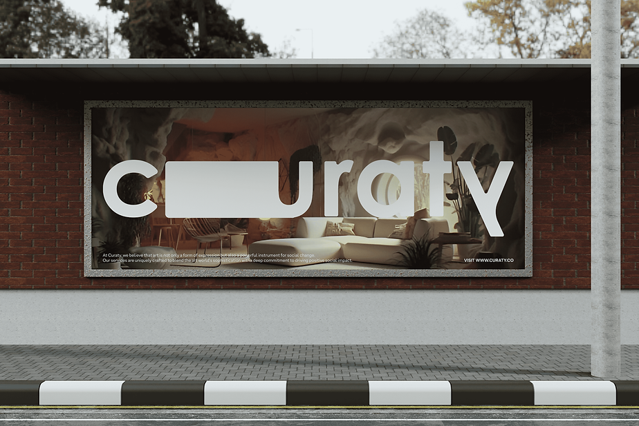
Curaty began with a brief for a simple rebrand—starting with the logo and then shaping an artistic style for the entire company. Young and agile, the founder, an art curator herself, was open to numerous ideas from the very beginning. Our conversations often delved into various artistic realms, and like many great projects, the answers emerged from complex experiments leading to simple solutions. Curaty aims to provoke individuals to question art, culture, and its purpose—the 'why'. The creative direction draws from this idea, building a world that reflects and amplifies this.


The typography, like a frame, curves the edges, stretches, and becomes a canvas for the art it inhabits. A humorous flipping of the 'Y' turns into a meta-text within the wordmark, questioning the purpose of its usage.


bottom of page